Why do my NanoBanana generations look so bland?

When running NanoBanana Pro, the quality comes out fine. The problem is… they all look similar and lack excitement.
At first, I thought, “Should I write the prompt harder?” so I wrote it long and detailed, but strangely, the more I did, the more plain and generic it became. So, to give you the conclusion first, it was this.
It was because I was trying to win with just one shot.
The Solution (Summary)
Don’t try to get one perfect shot. Instead, intentionally split the same character into 4 different drafts and then choose.
Copy-Paste Prompt Template
Copy the text below as is, fill in the { }, and run it.
Creating an illustration with "One Single Point" that grabs attention

[Core Point]
{Write only 1 visual attraction}

[Fixed Elements]
Same character, same outfit, same hairstyle, same atmosphere, high quality

[Variables] 4 Variations:

1.{Angle A} + {Gesture A} + {Color A} + {Composition A}
2.{Angle B} + {Gesture B} + {Color B} + {Composition B}
3.{Angle C} + {Gesture C} + {Color C} + {Composition C}
4.{Angle D} + {Gesture D} + {Color D} + {Composition D}

[Common Instructions] (Optional)
1. The core point must be visible at a glance within 1 second
2. Hand movements and facial expressions must convey clear meaning
3. Background must not interfere with the main character
4. Do not include unnecessary props
Examples of “One Visual Attraction” (Pick only one from here)
You can leave { } empty, but if you write the direction you want to show in one sentence like the examples below, you can create a more attractive image.
Examples of One Visual Attraction (Pick only one)
"Confident eyes looking straight at the camera"
"Overwhelming presence with just the gaze"
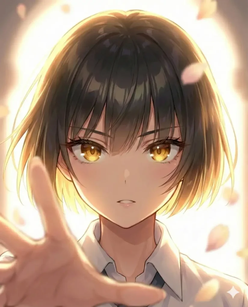
"Gesture of reaching a hand out of the screen"
"A smile with just the corners of the mouth slightly raised"
"Composition where the face is close to the screen, creating a distinct sense of distance"
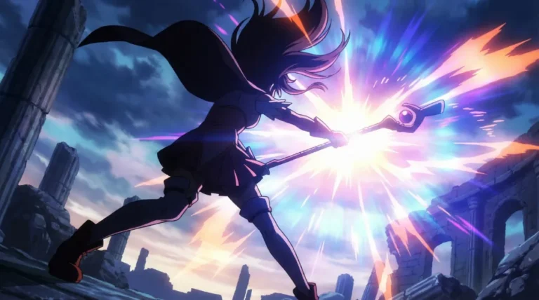
"The moment just before battle where 3 main characters glare in one direction"Important: Select only 1 element you want to show. The moment you put in 2, it becomes bland again.
If you want to keep it simpler, you can just use it like this.
Generate 4 drafts.

1.A: Change composition
2.B: Change hand/movement
3.C: Drastically change color only
4.D: Change character placement
Place the 4 images side by side and keep only the one that catches your eye first.

Selection Criteria
Adopt if it meets 5 or more out of 7.
- Can you identify the focal point in 1 second?
- Is the facial expression readable? (Is it visible even in a small thumbnail?)
- Is the meaning of the hand/pose conveyed?
- Does the background make the main character stand out? (Does it not interfere?)
- Is there movement in the composition? (Height difference/Depth/Distance)
- Do the props amplify the charm of the character?
- Do you want to see it again or share it?
For the image below, I cropped the first image and added additional direction to complete it.
One-Line Summary
It is easier to choose one well-generated image than to generate one image well.