How to Direct AI Illustrations: Completing Your Art with ‘Direction’
When AI images come out looking flat, we usually suspect “lack of detail” first. However, the real problem is rarely the detail. It is because we told the AI “Subject” (what to draw) but failed to tell it “Direction” (how to show it).
Subject is the ingredient, and Direction is the presentation.
If you simply throw in the ingredients, the AI kindly tries to “show everything.” As a result, the composition becomes distracting.
How to Direct AI Illustrations
1) Why listing only the Subject makes it flat
Common prompts look like this:
anime girl, holding sword, forest, detailed background, daylightThis isn’t a wrong prompt. However, its nature is different. This is not “Direction”; it is a “List of Materials.”
The AI defaults to acting like a camera. Unless instructed otherwise, it captures every element with similar importance. Consequently, the result usually looks like this: The screen is packed with information, there is nowhere for the eye to rest, and no emotion is conveyed. The key to solving this is the Direction sentence.
2) Formula to turn a list of materials into a single line of Direction
When drawing an illustration, these three things are usually decided first:
- Single Focal Point: Fixing the gaze on one spot
- Negative Space: Emptying to create a frame
- Thickness/Density Difference: Density only where needed, relax the rest
You don’t need to overcomplicate applying this to prompts. Just include the following two things:
Direction Sentence Formula
- “Where should the viewer look?”
- “What emotion should be felt first?”
You can refine it further by adding other techniques like negative space and density differences.
3) Visual Proof: Before vs After Experiment
This is a comparison between Version A (Material List) and Version B (Includes Direction). Even with the same model, the result changes completely depending on the direction instructions. If possible, try running it with the same model and style tags. The difference becomes clearer.
Version A: Standard (Before: Material List)
Subject: A magical girl holding a staff.
Composition: Full body shot.
Angle / Shot: Front view.
Action: Casting magic.
Location / Atmosphere: Fantasy ruins, glowing effects.
Style / Render: Anime style, vivid colors.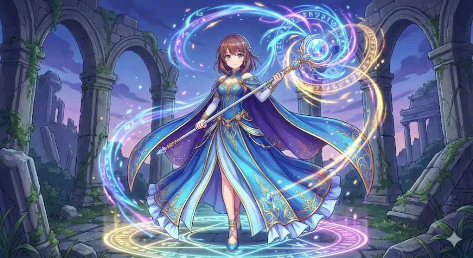
This is the most basic form. If you simply list words, you get high quality but static staging. Now, let’s add prompts related to direction to focus on where the attention should be. Here is the content of the prompt to be added.
Direction: She is leaning her body forward aggressively to control the overflowing power. Her right hand with the staff is thrust towards the camera (foreground), while her left leg is braced far back (background) to create depth. Her hair and cape are flowing wildly upwards, emphasizing the upward flow of energy.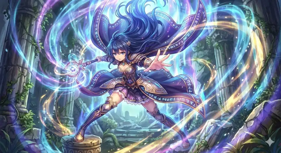
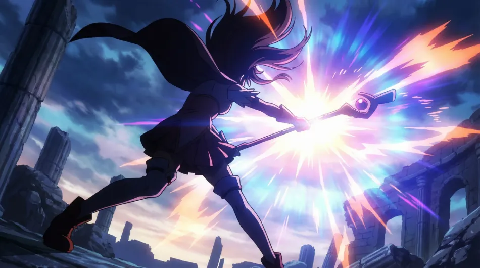
Version B: With Direction (After: Direction Optimized)
Subject: A magical girl holding a staff.
Composition: Dynamic silhouette with negative space clearly visible.
Angle / Shot: Low angle looking up, dramatic perspective.
Action: Strongly casting a spell.
Location / Atmosphere: Fantasy ruins, wind blowing from the magic power.
Style / Render: Anime style, high contrast, vivid colors.
Focus rule: Focus on the energy burst from the staff.
Direction: She is leaning her body forward aggressively to control the overflowing power. Her right hand with the staff is thrust towards the camera (foreground), while her left leg is braced far back (background) to create depth. Her hair and cape are flowing wildly upwards, emphasizing the upward flow of energy.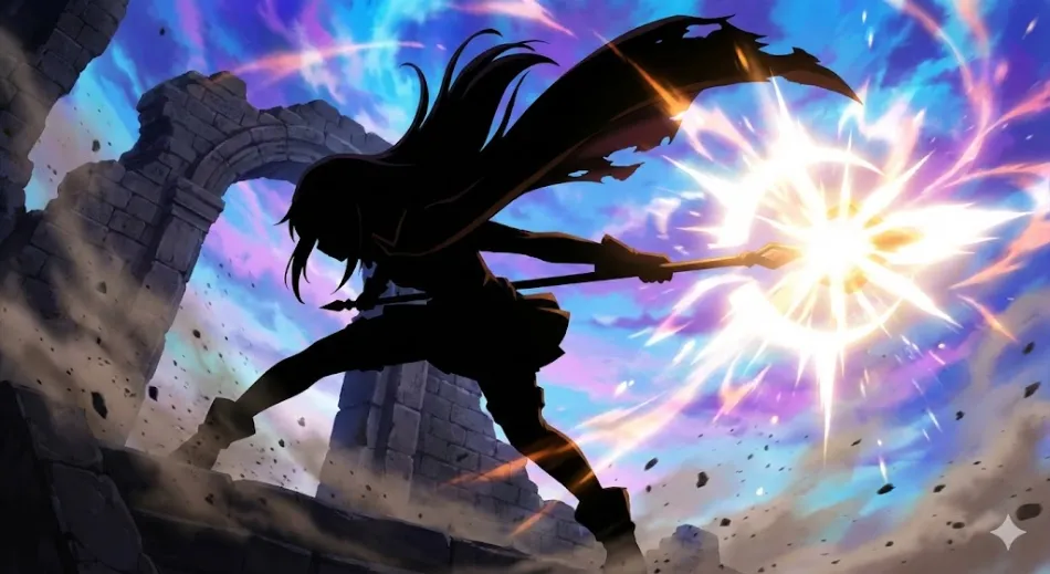
4) How to use it right away
Use it now
- Copy the Version B prompt above.
- Change only the Subject to “your character.”
- Describe and fix the “gaze” and “emotion” in a single line in the Direction sentence.